Midjourney-Style Models
Midjourney-style services turn short prompts into polished art through tuned defaults and community controls, favouring beauty over literal obedience.
Why Does This Exist?
Raw research models obey prompts and output competent ugliness: grey compositions, awkward crops, flat light. Most users want beautiful images, not literal ones, and will not engineer thirty-word prompts with lens names and film stocks to get them.
Aesthetic-tuned services close the gap as products. Curated preference tuning bakes photographic taste into defaults, while compact controls, stylize strength, chaos variety, aspect flags, prompt weights, expose the useful axes without exposing the machinery. The open-weights counterpart is stable diffusion, and the family map is text-to-image and text-to-video.
Think of It Like This
A restaurant versus a grocery store
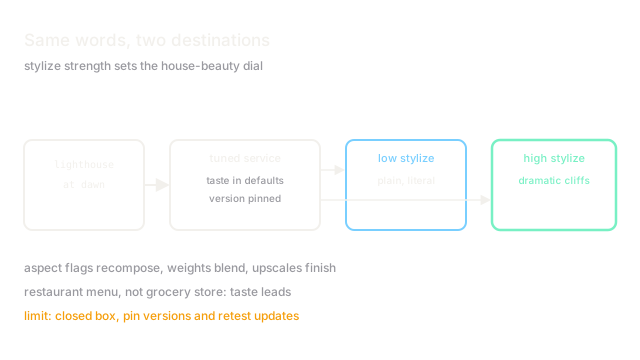
A grocery store sells exact ingredients for any recipe, maximum control, full effort. A restaurant serves a tasting menu: the chef's taste leads, diners pick courses and spice levels, nobody measures flour. Most diners prefer the restaurant most nights.
Open models are the grocery store and tuned services the restaurant. The menu limits control deliberately: regulars learn the chef's style and order around it. It fails for diners with strict diets, exact-specification work that needs the grocery store instead.
How It Actually Works
Observable behaviour, not internals: short prompts yield finished-looking images because defaults embed composition, lighting, and detail preferences learned from curated rankings. Documented-style controls adjust the rendering along a few axes. Raising stylize strength pushes outputs toward the house aesthetic and away from literal prompt details; lowering it returns obedience at beauty cost. Aspect flags recompose rather than crop, and multi-prompt weights blend concepts by emphasis.
Version progression moves the obedience-beauty frontier outward: newer versions follow longer prompts more literally while keeping the polish. Remaster and upscale passes add detail in second stages, echoing the cascade pattern, without user-visible machinery.
Worked example
Prompt a lighthouse at dawn: at low stylize strength the scene renders plainly, lighthouse centred, flat sky, high obedience. At high strength the same words return dramatic cliffs, volumetric fog, and cinematic grading the prompt never mentioned, prettier and less literal. Aspect 16:9 recomposes with extended seascape rather than stretching pixels. The control settings, not the words alone, decide where each output lands.
Watch Out For
House style leaking into client work
High stylize defaults stamp every output with recognisable grading and composition tics. Portfolios converge on one look, and clients asking for plain documentation get art instead.
Dial stylize down for literal work and compare against references. Default beauty is a choice, not a neutral setting.
Closed internals blocking diagnosis
When outputs go wrong there is no architecture to inspect, no weights to probe, no training set to audit. Prompt folklore substitutes for debugging, and version changes silently move behaviour.
Pin versions for production series and retest on every update. Treat the service as a supplier with changelogs, not a fixed tool.
The Quick Version
- Aesthetic-tuned services bake photographic taste into generation defaults.
- Stylize strength trades house beauty against literal prompt obedience.
- Aspect and weighting controls recompose and blend without exposing machinery.
- Newer versions push the obedience-beauty frontier outward together.
- House-style leakage and closed-internals diagnosis are the standing costs.