Kernel Density Estimation
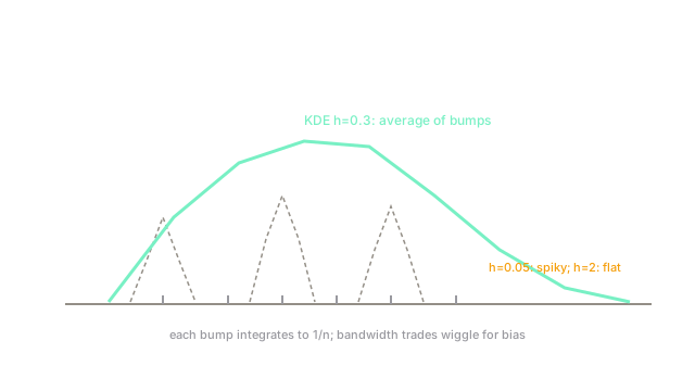
Histograms jump with bin edges. KDE centers a smooth bump on every point and averages them into a curve with no bins to argue about.
Why Does This Exist?
Histograms lie by binning: shift the edges and modes appear or vanish, and high dimensions make bins explode exponentially. Parametric fits lie by shape: data are rarely exactly Gaussian. Analysts need a smooth, bin-free picture of "where the data concentrate" before modeling.
KDE delivers it: one kernel per point, averaged, with bandwidth setting bump width. Gaussian kernels are the default. It needs only descriptive statistics as background and pairs with resampling in bootstrap and resampling.
The one idea you need first
A density integrates to 1 with tall where data crowd. Each kernel bump integrates to , so the average integrates to 1 automatically. Bandwidth is the only knob: small follows every point, large flattens everything.
Think of It Like This
Sand piles instead of buckets
A histogram sorts sand into buckets: move the bucket walls and the skyline changes. KDE drops one small sand pile on each grain and lets them merge into dunes.
Pile width is bandwidth: sugar-fine piles spike at every grain, gravel-wide piles flatten the desert. Where it stops: sand piles are physical and local, while KDE sums globally per query, which gets expensive on big without trees or FFT.
How It Actually Works
Bias shrinks as while variance shrinks as : the classic tradeoff, minimized near in 1D with integrated squared error . Silverman's rule starts Gaussian-ish cases. Multivariate KDE needs full bandwidth matrices and degrades fast with dimension: effective samples shrink exponentially, so past ~5D prefer parametric or projection methods.
Worked example
Eight points with Gaussian . At , kernel contributions peak for the 2.0 and 2.2 neighbors: each contributes , distant 5.0 contributes under . Summing all eight gives . With the same spikes above 1.0 between points and crashes between them; with it flattens near 0.12 everywhere.
Code
import numpy as np
x = np.array([1.0, 1.5, 2.0, 2.2, 3.0, 3.5, 5.0, 5.2])h = 0.3grid = np.array([2.1])dens = np.exp(-0.5 * ((grid[:, None] - x) / h) ** 2).sum(axis=1)dens = dens / (x.size * h * np.sqrt(2 * np.pi))print(round(float(dens[0]), 2)) # -> 0.42The hand sum and the code agree at 0.42. Change to 0.05 or 2.0 and watch spike versus flatten.
Watch Out For
Trusting default bandwidths blindly
Silverman assumes near-Gaussian data and oversmooths multimodality: two real humps merge into one, and analysts conclude one segment. Undersmoothed defaults do the reverse, inventing modes from noise.
Plot several bandwidths across a decade of . If the mode count changes, the default decided your conclusion, not the data.
KDE on high dimensions or bounded edges
In 10D, neighborhoods are empty and bumps never overlap: the curve is spikes on a plain. On bounded data, symmetric kernels leak mass across the edge and understate near-zero density.
Cap KDE at low dimensions, use boundary correction or logs near edges, and switch families past ~5D. If most query points see one bump, dimensionality won.
The Quick Version
- KDE averages one -mass bump per point; no bins, one bandwidth knob.
- Bias , variance ; optimal in 1D.
- Eight-point example at gives .
- Tiny spikes on noise, huge flattens real modes; scan a decade.
- Past ~5 dimensions or on hard boundaries, correct or switch methods.
- Naive queries cost each; use trees or FFT at scale.