UMAP
Build a neighbour graph, scale each point's edges by its own nearest neighbour, then lay the graph out. Faster than t-SNE, and the gaps still aren't distances.
Why Does This Exist?
An insurance team has 400,000 claim descriptions, each turned into 384 numbers by a language model. They want a map: which claims resemble which, where the odd ones sit, whether known fraud cases clump anywhere.
t-SNE is the obvious tool and it hits three walls here. Hours at this size. Between-cluster gaps that carry no information. And no way to place tomorrow's claim without refitting everything, which rules it out of a pipeline. UMAP was built against those three: same promise, neighbours stay neighbours, reached a different way — and the different way buys the speed and the reusability.
One idea first. A graph is points with weighted connections between them (the basics). UMAP is a graph algorithm wearing a plotting library's clothes.
Think of It Like This
A pinboard of elastic bands and weak magnets
Pin all 400,000 claims to an enormous corkboard. For each claim, run an elastic band to its fifteen closest relatives, tighter the closer the relative. Every other pair gets a weak magnet pushing them apart. Then let go: banded pins pull together, everything else drifts, the board settles.
The clever bit is how bands get measured. Cut them all to the same absolute length and the crowded corner — thousands of near-identical windscreen claims — becomes one solid mass, while the sparse corner has almost no bands. So each pin's bands are measured relative to its own closest relative, and a crowded pin and a lonely pin both end up properly connected.
And one knob does nothing to the bands: the rule for how close two pins may sit. Tighten it and the clumps pack into islands with obvious white space. The bands never changed — only the pins moved.
How It Actually Works
From distances to a weighted graph
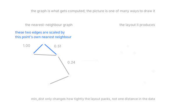
For every claim, find its n_neighbors nearest neighbours and draw a weighted edge to each. The weight falls off with distance — but first the distance to the claim's own nearest neighbour is subtracted off, and the falloff is scaled so each point's weights sum to a fixed amount.
That subtraction is the density trick. A claim in a dense region and a claim out on its own produce comparable edge weights, even though their raw distances differ threefold. No global radius exists anywhere in the method, which is exactly what DBSCAN struggles without.
Edges disagree — A may list B while B, in a crowd, doesn't list A — so the two directions combine into one symmetric weight. The result is a weighted graph, the only thing computed from your data.
From graph to layout
Now place points in low dimensions so connected pairs sit close and unconnected pairs sit apart, by gradient descent. Two shortcuts make it fast: the neighbour graph is approximate, and the repulsion is sampled — random non-neighbours per step rather than all 400,000. Minutes rather than hours.
More global arrangement survives than in t-SNE, because the graph connects the whole dataset instead of being assembled from independent per-point neighbourhoods. Relative cluster positions therefore carry some information: two groups drawn adjacent are more plausibly related than two at opposite corners. Some is not metric. Don't quote a between-cluster distance, and don't read cluster areas.
Two things make it more than a plotting tool. It embeds into any number of dimensions — ten or twenty columns feeding a clustering step is common. And a fitted model has a transform, so tomorrow's claim gets coordinates without moving anything else, which is what lets it sit in a pipeline. A supervised mode exists too: fraud labels pull same-label points together in the graph. Useful for looking, and a trap — see below.
The two dials, and what they don't move
n_neighbors sets how much of the data each point sees. At 5, local detail, small islands, and a global arrangement you shouldn't trust. At 200, broad shape with fine structure smoothed away. It changes the graph, so it changes the answer.
min_dist sets how tightly points may pack in the layout, typically 0.0 to 0.99. Low gives crisp blobs; high spreads everything into a haze. It touches only the drawing — the graph is identical either way, and no distance in your 384 dimensions moved.
Hold onto that asymmetry. One dial changes what was computed. The other changes how convincing the picture looks.
Code
The density trick, on two clusters of the same shape with four times the spread.
import numpy as np
def edge_weights(X: np.ndarray, i: int, k: int = 5) -> tuple[np.ndarray, np.ndarray]: d = np.sort(np.sqrt(((X - X[i]) ** 2).sum(axis=1)))[1:k + 1] rho = d[0] # the distance to this point's OWN nearest neighbour sigma = (d - rho).mean() # a per-point scale, so no global radius is needed return d, np.exp(-(d - rho) / sigma)
rng = np.random.default_rng(5)crowded = rng.normal([0.0, 0.0], 0.25, (150, 2))thin = rng.normal([6.0, 0.0], 1.00, (150, 2)) # four times as spread outX = np.vstack([crowded, thin])for name, block in (("crowded", crowded), ("thin ", thin)): i = int(((X - block.mean(axis=0)) ** 2).sum(axis=1).argmin()) # a typical member d, w = edge_weights(X, i) print(name, "raw distances", np.round(d, 2), " edge weights", np.round(w, 2)) # -> crowded raw distances [0.04 0.05 0.05 0.06 0.07] edge weights [1. 0.51 0.49 0.24 0.11] # -> thin raw distances [0.12 0.2 0.23 0.24 0.25] edge weights [1. 0.42 0.28 0.25 0.23]Raw, the two points live at different scales. Subtract each one's own nearest-neighbour distance, rescale, and both report much the same neighbourhood. One model, a crowded region and an empty one.
Watch Out For
Turning min_dist down until the clusters look separated
A slide shows six crisply separated islands, captioned as proof the claim types are distinct. Check the call: min_dist=0.0. Rerun at 0.5 and the islands become one smear, because min_dist is a floor on how close points may sit in the drawing and nothing more.
Nothing in the data changed. Nothing in the graph changed. To claim separation, measure it in the original 384 dimensions — nearest-neighbour purity, or silhouette on the raw vectors — and report both parameters beside every plot. Then use the picture for what it's good at: noticing you have six groups, not four.
Fitting the embedding on train and test together
The pattern: run UMAP on all 400,000 claims, split train and test, train a fraud classifier on the UMAP columns, get a cross-validated score better than anything on the raw features. That's leakage — the test rows helped decide where they'd land, next to their neighbours and their neighbours' outcomes.
Fit on the training rows only, then transform everything else. Inside cross-validation, UMAP goes in the pipeline so it refits per fold. Supervised mode makes this far worse: if labels shaped the embedding, any score measured on it is meaningless, because the answer is in the coordinates. Use supervised UMAP to look, never to build features you then score.
The Quick Version
- Build a weighted nearest-neighbour graph, then lay it out by pulling connected points together and pushing others apart.
- Each point's edge weights are scaled by its own nearest-neighbour distance, handling regions of different density without a global radius.
- Faster than t-SNE at scale, and more global structure survives — but relative positions are suggestive, not measurable.
n_neighborstrades local detail against global shape and changes the graph.min_distonly changes how tightly the layout packs.- It embeds into any number of dimensions and transforms new points, so it fits in a pipeline. Supervised mode is useful for looking, dangerous for modelling.