t-SNE
It keeps neighbours together and protects nothing else, so the gaps between the clusters you can see, and the sizes of those clusters, carry no information.
Why Does This Exist?
You have a thousand bird recordings and a model that turns each into 128 numbers. One question: do the three species separate, or does your model hear them as the same thing?
The obvious move is PCA. First two components, plot, look. Often you get one grey blob holding 22 percent of the variance, and you can't tell whether the structure isn't there or whether PCA couldn't reach it — it only rotates, and three species on a curved sheet in 128 dimensions don't flatten into separate patches under any rotation.
That's the wall t-SNE was built against. It gives up on geometry entirely and optimises for one thing: whoever was your neighbour before should be your neighbour in the picture. Everything else is a by-product.
Think of It Like This
The subway map that lies about distance
A subway map draws adjacent stations evenly spaced whether they're 300 metres apart or three kilometres, inflates the central zone so labels fit, and squeezes the outer branches. Nobody complains: the map only ever promised which stations connect to which, and in what order.
That's t-SNE. Neighbourhoods are the promise; distance and area were sacrificed so they could fit on a flat page at all.
The mistake is bringing a ruler. Two lines at opposite edges of the sheet can run parallel down the same street. The map didn't lie; you asked a question it never claimed to answer.
And when a new station opens, the designer redraws the map; nothing places one stop without moving the rest. Same gap in t-SNE, and it's why the thing can't sit in a pipeline.
How It Actually Works
From distances to neighbour probabilities
Take one recording. Measure its distance to all 999 others, then turn those distances into probabilities: if this call picked a neighbour at random in proportion to a bell curve centred on itself, how likely is each of the others? Close calls take almost all the probability; distant ones almost none.
The width of that bell curve is set per recording, by bisection, so the effective number of neighbours matches a number you choose: perplexity. Perplexity 30 means roughly "treat about 30 recordings as this one's local circle".
The heavy tail, and what the objective actually pays for
Similarity in the map comes from a t-distribution with one degree of freedom, not a bell curve. Its tail is fat: at four times the distance it still assigns real probability where a bell curve has effectively none.
That fixes a counting problem. In 128 dimensions a point can have far more roughly-equidistant neighbours than a flat page has room for, so a faithful map jams everything into the middle. The heavy tail lets moderately distant pairs sit far apart without the objective charging much. All that white space between groups? That's the tail, not the data.
Gradient descent then moves the 2D points to shrink the KL divergence between the two sets of probabilities — one number for how badly one distribution stands in for another (the details):
where is a pair's neighbour probability in the original 128 dimensions, is the same pair's probability in the map, and the sum runs over every pair. The asymmetry is the whole story. True neighbours drawn far apart carry a big penalty; strangers drawn close together carry almost none. So neighbourhoods get protected fiercely, and everything else is slack.
What the picture does not tell you
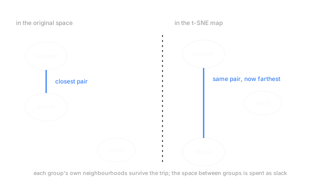
Distances between clusters mean nothing. The objective only pays for getting neighbourhoods wrong, so two groups at opposite ends of the map may be closer in the original space than two drawn side by side. The diagram shows that swap.
Cluster sizes mean nothing either. Each point's bell curve scales to its own local density, expanding sparse regions and contracting dense ones. A tight cluster of near-identical calls can come out a broad loose cloud.
Perplexity changes the picture, not the data. At 5 you get a scatter of small islands; at 100 they merge into continents. Neither is the truth. Trust only structure that survives several values.
Two runs disagree. Random initialisation and a stochastic objective give a different map each time — rotated, rearranged, sometimes with one group split in two. Fix the seed for reproducibility; that isn't stability.
Code
Perplexity doesn't select neighbours. It selects a bandwidth per point — here's the bisection that does it, on 600 synthetic calls from three species.
import numpy as np
def row(d2: np.ndarray, sigma: float) -> np.ndarray: p = np.exp(-d2 / (2.0 * sigma ** 2)) return p / p.sum() # one call's distribution over all the others
def sigma_for(d2: np.ndarray, target: float) -> float: lo, hi = 1e-2, 1e4 for _ in range(80): # perplexity climbs with sigma, so bisect on it mid = 0.5 * (lo + hi) p = row(d2, mid) perp = 2.0 ** -float((p * np.log2(p + 1e-12)).sum()) lo, hi = (mid, hi) if perp < target else (lo, mid) return mid
rng = np.random.default_rng(3)species = np.repeat(rng.normal(0.0, 9.0, (3, 16)), 200, axis=0)calls = species + rng.normal(0.0, 1.0, (600, 16))d2 = ((calls[1:] - calls[0]) ** 2).sum(axis=1)for target in (5.0, 30.0, 150.0): print(f"perplexity {target:6.0f} -> sigma {sigma_for(d2, target):7.2f}")# -> perplexity 5 -> sigma 0.95# -> perplexity 30 -> sigma 1.37# -> perplexity 150 -> sigma 2.40Ask for 5 neighbours and this call's bell curve is 0.95 wide. Ask for 150 and it's 2.40 — that number fixes what "local" means before a single point moves.
Watch Out For
Quoting a distance or a size off the plot
Someone puts a t-SNE map on a slide and writes underneath that two species sit "roughly three times the within-group spread apart", or that one group is more varied because its blob is bigger. Both numbers came off the screen with a ruler; change the seed and both change.
State separation with a number computed in the original 128 dimensions — a silhouette score, or nearest-neighbour purity; clustering evaluation covers the options. Use the plot for what it's good at: noticing you have three groups rather than two, or one recording sitting deep inside the wrong species.
Using it as a preprocessing step
The pattern: 128 dimensions down to 2, train a classifier on the two columns, get a strong cross-validated score, then find at deployment there's no way to place tomorrow's recording. There's no transform — a new point arrives only by refitting, and refitting moves every other point.
The score wasn't real either. The embedding saw all 1,000 recordings including the ones you scored on, so held-out rows helped decide where they themselves would land — leakage, in the flattering direction as usual. Need low-dimensional features inside a model? PCA and UMAP both embed new points from an already-fitted model.
The Quick Version
- Neighbour probabilities in the original space, the same in 2D with a heavy-tailed t-distribution, then minimise the KL divergence between them.
- The heavy tail stops everything crowding into the centre; it's where the white space between groups comes from.
- Neighbourhoods are preserved. Between-cluster distances, cluster sizes and overall geometry are not.
- Perplexity sets neighbourhood size. Check several; structure that shows at only one value isn't structure.
- Non-deterministic by construction. Two runs, two different pictures of identical data.
- No transform for new points, so it belongs on a slide, not in a pipeline.