Exploratory Data Analysis
Looking at your data before you model it, in a fixed order, where every answer you get turns into a written decision about a column, a row, or a split.
Why Does This Exist?
A team ships a model that predicts what a used car will sell for. It scores beautifully in testing, then loses money on nearly every deal in week one.
Nobody had plotted sale_price against list_price. Three rows in ten sat exactly on the diagonal, because a nightly job copied list into sale whenever the real figure was late. The model learned to hand back the list price. An echo, not a prediction.
Every single-column summary was fine. Plausible means, no blanks, no absurd extremes. The problem was never inside a column. It lived in a pair.
So this gets done on purpose. It isn't plotting until you feel better about the data. It's a fixed interrogation in a fixed order, whose output is written down: which columns are unusable, which need a transform, what the split has to respect, and which rows you go and ask about.
Can't produce those four lists? You looked at your data. You didn't question it.
Think of It Like This
An inspection sheet, not a nice look round
Your friend walks round a used car, kicks a tyre, says "yeah, looks clean". That's the report. Worth about what it cost.
A mechanic does something else, and the difference isn't skill. They follow the same order every time. Fluids, tyres, panels, diagnostics. Each step answers one question and each answer lands on a sheet. Front discs at 2mm, replace before you drive it. Door plate doesn't match the logbook, walk away.
The sheet is the product, not the looking. Someone who never sat in that car can read it and act.
And the mechanic inspects the car you're buying. If they could also inspect the one you'll be judged against at auction, and quietly tune the quote to it, the quote would stop predicting anything.
How It Actually Works
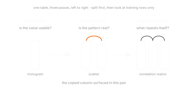
Three passes over the same table, in this order, because each is only readable once the last is done. One plot per pass.
Pass one, one column at a time
The plot is a histogram, and a summary table is not a substitute. Read the shape, one hump or two and which tail runs long. Read the range against what's physically possible. Watch for spikes on a single value: 0, -1 or 999 is a sentinel, a blank wearing the clothes of a measurement.
Each finding becomes a sheet entry. Sentinels convert to null before anything is fitted, a long right tail wants a log transform for a linear model and nothing for a tree, and the blank fraction per column feeds missing data.
Pass two, two columns at a time
Numeric against numeric, a scatter. Numeric against categorical, a box plot by category. Look for direction and curvature, since those want different models. Look for points on a line they've no business sitting on: an exact functional relationship means one column was computed from the other. And plot every candidate against the target, since a clean relationship there is a leak more often than a gift.
Pass three, many columns at once
A correlation matrix, drawn as a heatmap. Blocks of mutually correlated columns mean you're carrying the same information several times, which distorts linear coefficients and changes what dimensionality reduction does. A relationship that flips sign once you condition on a group only shows up here.
Pass two says a relationship exists. Pass three says whether you believed the right reason for it.
All of it runs on training rows
Split first, then explore the training rows and nothing else. People wave this off because there's no code in it. The catch is that you're the fitting step: you see a long tail in the test rows, pick a log transform, and that decision is a parameter set from held-out data. Nothing recorded it, so no audit finds it. The channel was a person.
Worked example
Eight cars, list price and sale price in hundreds:
list_price sale_price 240 228 300 285 180 171 455 455 280 266 520 520 200 190 380 380Pass one, sale_price: mean 311.9, range 171 to 520, no blanks, nothing bimodal. list_price: mean 319.4, range 180 to 520. A summary table hands both a clean bill.
Pass two: divide one by the other and the ratio is 0.95 five times and exactly 1.00 three times. Those three rows are identical across both columns, so a scatter puts five points on one line and three on . Markets don't do that.
The correlation is 0.999, which is also what a genuinely useful feature looks like. The tell is the shape.
Code
The same eight rows, twice. Pass one clears them, pass two doesn't.
import numpy as np
list_price = np.array([240.0, 300.0, 180.0, 455.0, 280.0, 520.0, 200.0, 380.0])sale_price = np.array([228.0, 285.0, 171.0, 455.0, 266.0, 520.0, 190.0, 380.0])
def univariate(col: np.ndarray) -> tuple[float, float, float]: """One column at a time. This is all a summary table ever shows you.""" return float(col.mean()), float(col.min()), float(col.max())
def bivariate(a: np.ndarray, b: np.ndarray) -> list[float]: """Two columns at a time. The distinct ratios a scatter would draw.""" return np.unique(np.round(b / a, 3)).tolist()
print(univariate(sale_price)) # -> (311.875, 171.0, 520.0)print(univariate(list_price)) # -> (319.375, 180.0, 520.0)print(round(float(np.corrcoef(list_price, sale_price)[0, 1]), 3)) # -> 0.999print(bivariate(list_price, sale_price)) # -> [0.95, 1.0]Two distinct ratios, where a market hands you eight.
Watch Out For
Exploring the full dataset before splitting it
Load everything, plot everything, split once you know what you're dealing with. It feels like the sensible order.
Looking is a fitted operation when a person does the fitting. You spot the skew across all 40,000 rows, so you pick a log transform. A rare category shows up 11 times, so you fold it into "other". Both thresholds were chosen with the test rows in the room, and there's no fit() call to point at.
Damage scales with the number of decisions. One transform over 40,000 rows, barely anything. Twenty choices over 800 rows, and your holdout has stopped being one.
Fix it by order of operations, not willpower. Split on line one, seed written down.
Trusting the numbers because the numbers agree
Anscombe's quartet. Four datasets, eleven points each, all with mean x of 9.0, mean y of 7.50, matching variances, correlation 0.816, and the same fitted line .
Plot them and they share nothing. One is a tidy straight relationship. One is a clean curve, so a linear fit is the wrong model. One is a straight line with a single point dragging the slope. One is a vertical stack at one x value with a lone point off to the right doing all the work.
The numbers agree and the data doesn't, because a mean and a variance are two numbers standing in for a whole shape. Never report a mean without seeing its histogram, or a correlation without seeing its scatter. df.describe() is where you start.
The Quick Version
- The output is a written list of decisions, not a folder of plots.
- Three passes, in order: one column, two columns, many columns.
- Pass one is the histogram. Hunt shape, range, sentinel spikes, near-constant columns.
- Pass two is the scatter. An exact relationship between two columns means one was computed from the other.
- Pass three is the correlation matrix, for duplicated information and sign flips that appear only under grouping.
- Split before the first plot. Picking a transform after seeing test rows is leakage with no code in it.
- Identical means, variances and correlations sit over four unrecognisably different shapes.
- A feature that tracks the target too cleanly is a suspect, not a win.